Koi Energy ReBranding
Design Brief
The SDSU Design Studio class teamed up with young entrepreneurs from the ZIP Launchpad on campus to redesign their current products and brand systems. Designers were tasked with creating solutions for a new overall brand system including, gum packaging, apparel, business card, paper system, and responsive website home page. I had the opportunity to be a leader on this project where I created presentation decks, gathered mockups and supplied important deadline information to the rest of the group.
Previous Branding
Moodboard
Solution
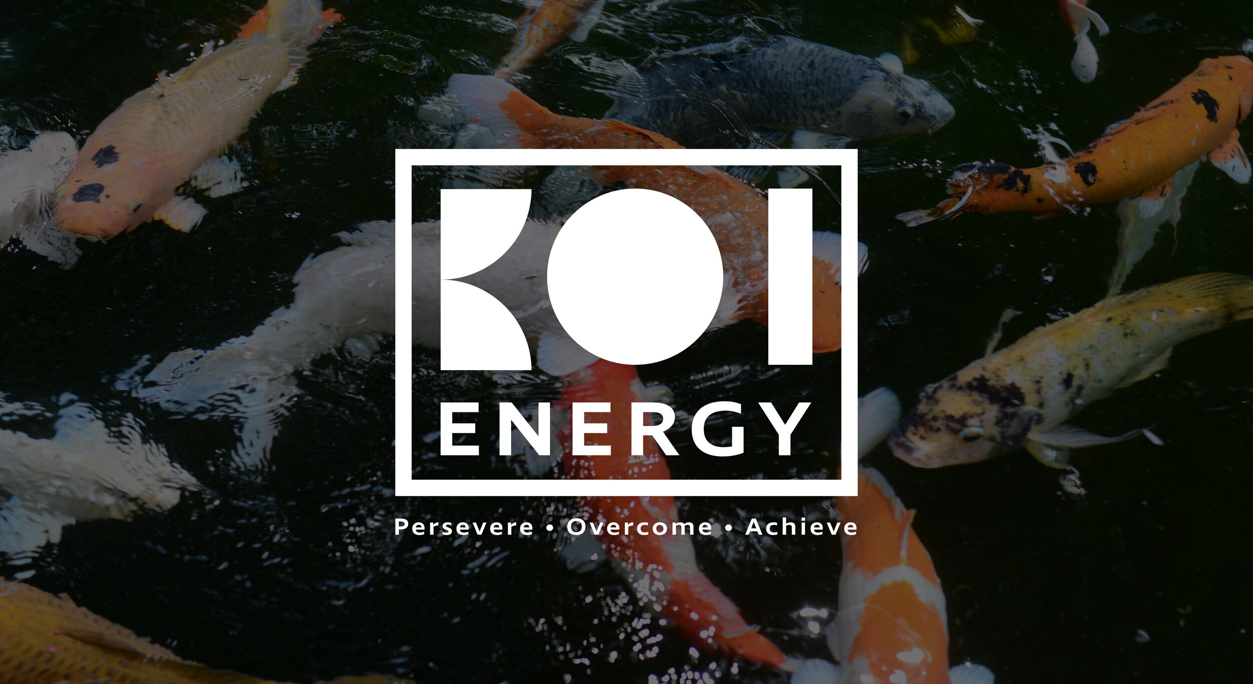
KOI Energy aims to be a call-to-action lifestyle brand that focuses on products and content to help the consumer persevere through adversity and become the best version of themselves. Based on the Japanese legend of the koi fish, the values of KOI Energy include perseverance and determination. The final logo I created is comprised of simple geometry which creates letterforms that mimic elements from an abstracted koi fish. The logotype is enclosed with a rectangular stroke and accompanied by the brand’s tagline “persevere, overcome, achieve” to further promote the bold look and feel of the brand.
Packaging Design
For my packaging, I wanted to translate the logo into a pattern and utilize a black background so that the red to orange gradient could really pop. Secondly, I wanted to incorporate this almost neon blue color to promote the peppermint flavor as well as relate back to that bold, energetic feeling. I also combined the symbol of the peppermint leaf with the lightning bolt to simplify these elements from the previous design. I strategically chose these colors and how they would work together, while also focusing on how legible they would be when they interacted.
Collateral
Responsive Website Homepage Design
Lastly, for my digital application, I wanted the homepage of the website to really focus on the brand values. By showcasing these values as well as the legend of the koi fish, customers will immediately recognize and connect with brand as a whole. I also wanted to provide the benefits of your gum so that consumers will see why Koi Energy is a better choice than the competitors. Then to make for a smooth transition and to promote the energy gum, I placed the “buy now” button right underneath the benefits so as people scroll, they will be directed towards purchasing the gum.


