Vintage Glass Editorial
Design Brief
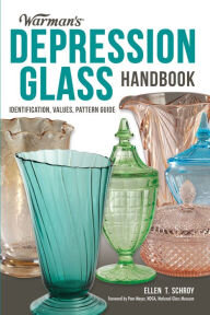
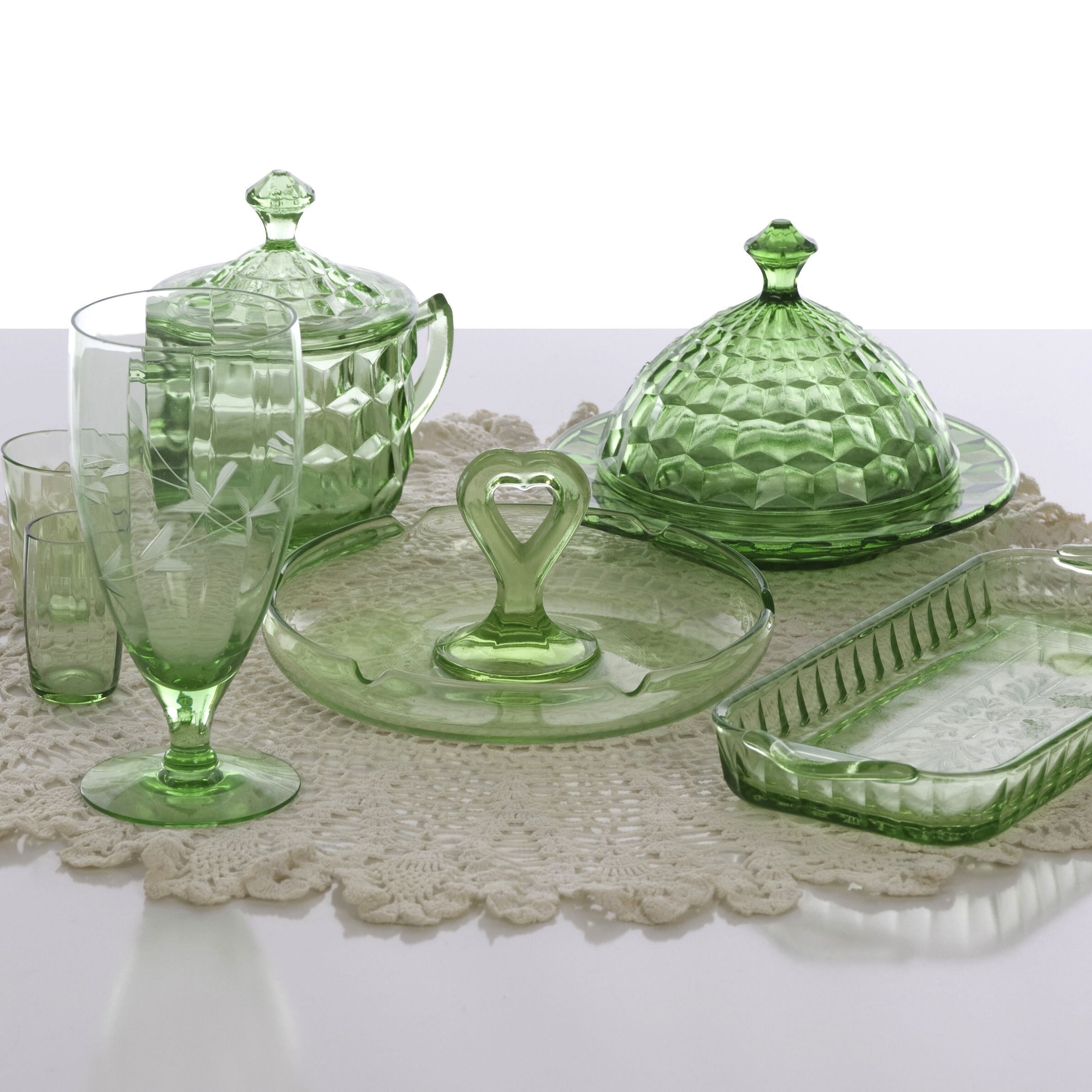
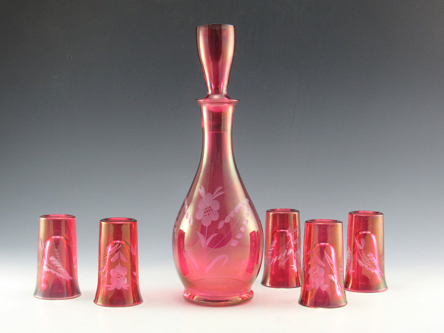
I have always admired editorial layouts, so when I got the opportunity to choose the topic of an editorial project, I wanted to create something that was close to my heart. Growing up, my grandmother had a cabinet full of all different types of pink cranberry glass from the Depression. I also remember sneaking candy out of an ornate milk glass container from her coffee table. Not many people know about vintage glassware, so I created this editorial to pay homage to my grandma and take the opportunity to create something modern and playful or of a subject that many people could find mundane.
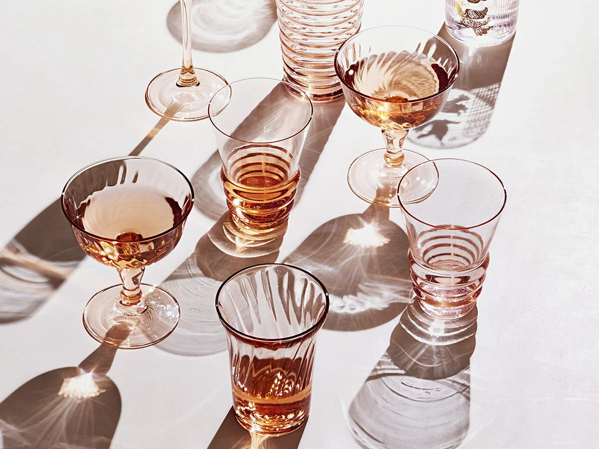
Moodboard
Challenge
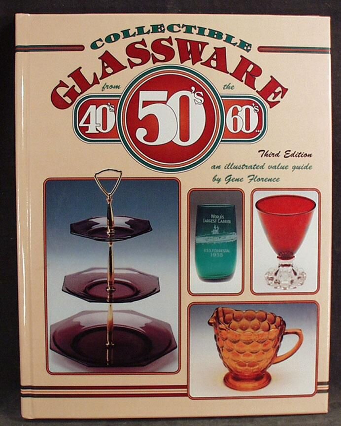
Many vintage glassware collectors books are so old that their pages have turned brown. You can tell immediately when you pick one up that the layout and design elements were not at all the priority. Old catalogs were mostly for buying and selling purposes and I wanted to create something that really showcased the beauty of these ornate pieces.
Solution
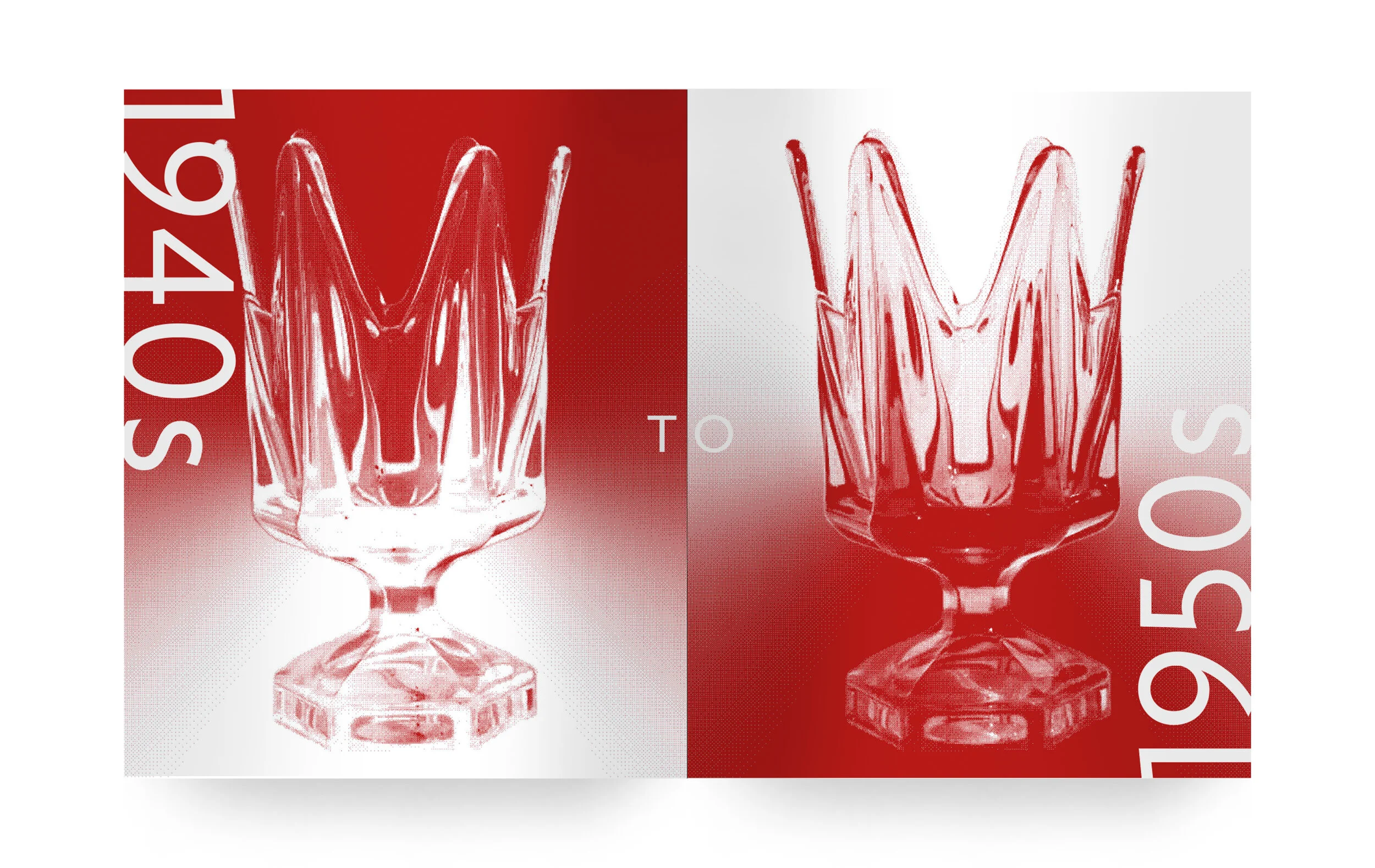
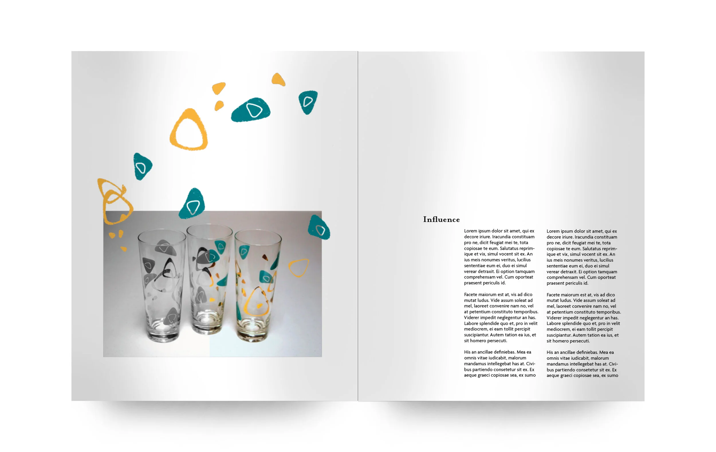
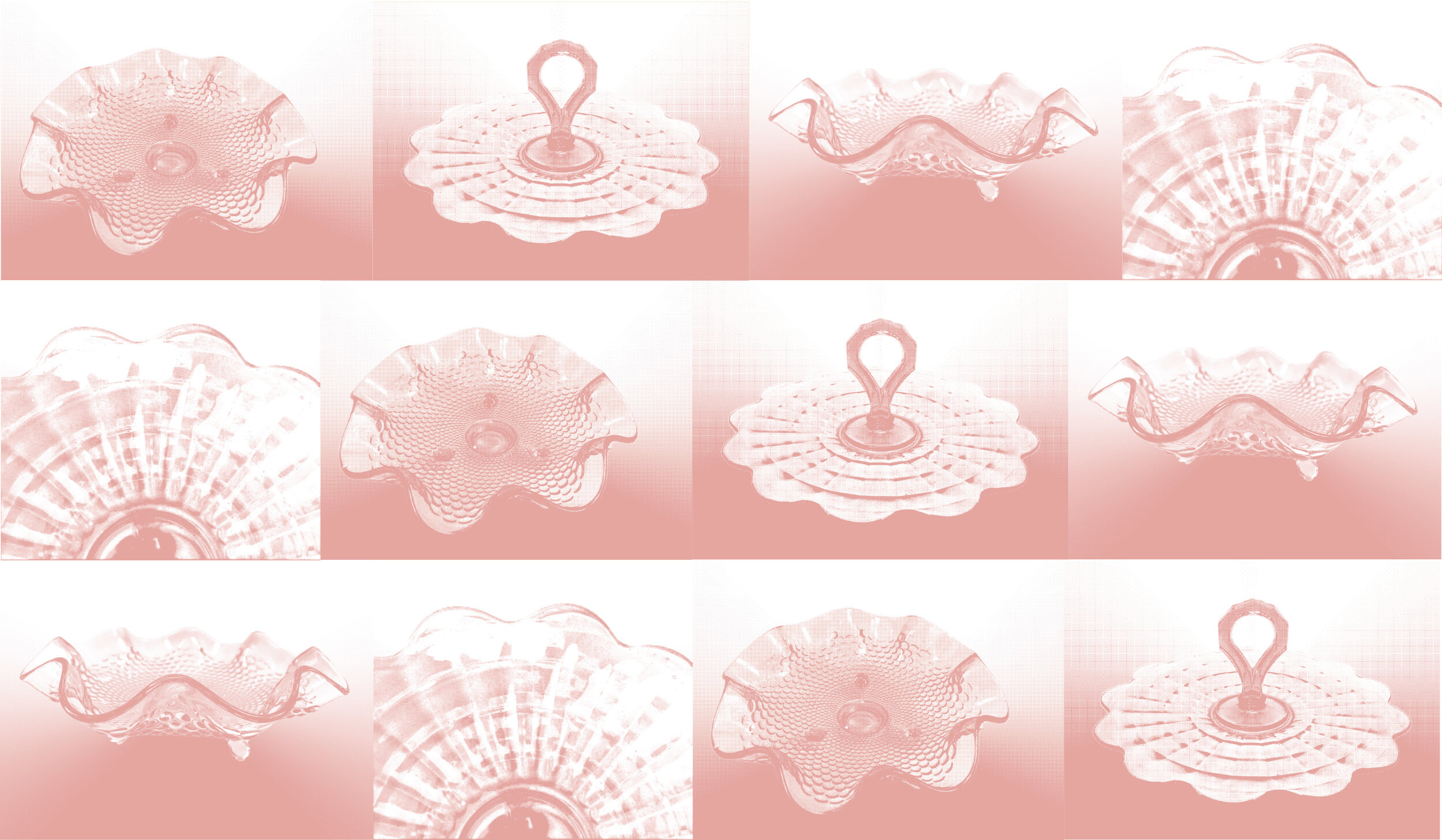
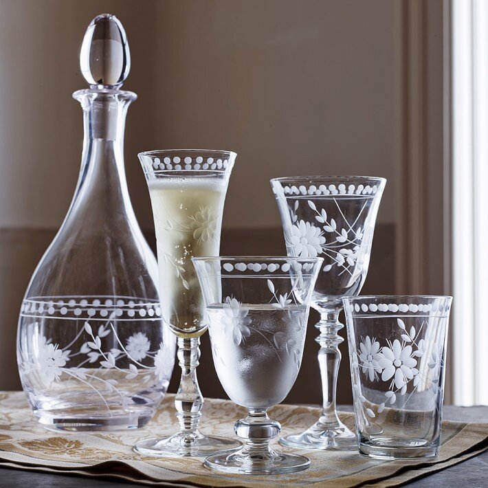
My goal for this editorial was to play with the idea of old and new. The topic of this editorial may not suit everyone, but I wanted to ensure that people would at least be intrigued by the imagery, if not the subject matter. To capture reader’s interests, I used bold duotone images along with a bright, fun color palette. I wanted the overall look and feel to be whimsical and ethereal. To promote these feelings, I would take sections from an image, desaturate them then bring interest back by pairing them with hand drawn illustrative details relating to the piece.
Typography
As soon as I began the initial process in creating this editorial, I thought that the content would pair beautifully with Mrs. Eaves. Mrs. Eaves is a bolder, more modern take on Baskerville and I thought it would work perfectly as a display font for paragraph and section headings. I wanted to pair this serif font with a humanist sans serif, Agenda, to give it a more modern feel. Pairing the two together create perfect balance and harmony in the overall layout.


